Wednesday, September 25, 2013

Boooorrring Photo of My Living Room; or, how to spice up a corner?

1 comment:
I’m kind of all over the place when it comes to decorating our house.  I start one project, get thinking about another one, find something amazing thrifting or garage sale-ing which sets my creative gears in motion for yet something else, have a few pieces of furniture in the garage/shed waiting for the right spot to open up in the house---just like everyone else, right??  I’m sure there are many that have much more decorating multi-tasking going on than me (many!!!).  But still, my husband probably thinks I’m rather crazy…in a completely endearing way…of course.  :)  I am  still planning the big girl bedroom, although very slowly.  I also have a project involving stain going on in the garage. 
Which leads me to this picture of our living room in its current state this morning.  I pushed a basked of (clean) laundry out of the picture before I took it.  You’re welcome!
IMG_7018

I’m sure there are many questions that could be asked now:
Weren’t you just talking about planning a big girl bedroom…are you easily distracted or something?
Why do you have a TV from the Dark Ages?
Why is the wall purpl-ish?
Do you ever clean your TV screen?
Is that an aquarium stand that the TV is sitting on?  (yes, yes it is)
All good questions I am sure.  But for today, I’m asking this question:
How does one decorate an awkward corner such as this?
This has been the burning question at the back of my mind this morning.  See all the outlets, switch, AC controls?  I’m trying to figure out how to camouflage them somehow, or at least make them look more intentional.  I realize our TV stand has much to be desired.  I was trying to give it away  before we moved but no one would come and take it off our hands for free.  We figured we can always burn it if we can’t get rid of it any other way (in that big fire pit we now have in the backyard!).  I would like to get a cabinet that will hide our TV completely (for reasons I’m sure you can completely understand!). 
I’m a very visual person, so off I went to find some pictures of corners that aren’t so embarrassingly boring.  It proved rather difficult to find corners that both looked nice and had a TV in them.  I’m sure for many having the TV out front and center would be no biggie, but we don’t really watch it that much and I personally hate how it looks so it seems like a good idea to hide it somehow.  Most of the pictures I found looked something like this:
Admittedly better than what we have now but not quite what I was going for.  I’m looking for something a little more along these lines, but with a (hidden)TV in there somewhere:
Art gallery corner
corner gallery
These corners are pretty and planned and less like the black holes of the room (or in our case, purple holes).  I love the collected look of these gallery corners too.  I’m kind of a sentimentalist so I’m always keeping little things that mean something to us.  This comes in handy when you’re trying to put together an arrangement with meaning in it!
I guess I’ll have to keep my eyes open on Craigslist and while thrifting to see if I can find a cabinet or other type of storage unit that our bulky TV will fit in (and that already is or has the ability to become pretty!).  Hmm, add that to the list!  I don’t need an excuse to go thrifting but I’ll always take one.  :)
Meanwhile, I know you’re wanting to pin my *gorgeous* living room corner so I’ll leave you to it! 

Monday, September 16, 2013

This and That and Planning a Big Girl Bedroom

2 comments:

This morning was one of those crisp fall mornings when you feel like you can get everything on your to-do list done…if only for a few hours. :)

I’m working outside on one of our front flower beds that is in sorry shape today and although I’m tethered to a box of Kleenex due to my awful fall allergies, I’m still enjoying the beautiful weather.  Fall always makes me a bit nostalgic.  :)  Plus it is really nice to be able to garden without breaking a sweat or fighting with mosquitos!

We celebrated our older son’s 3rd birthday over the weekend.  He had a lot of fun and so did we watching him enjoying his cake and presents.  He got some Playmobil knights which he is just ecstatic over.  I made him a cake using this recipe and I have to say it is one of the better (and easiest!) chocolate cakes I have tasted recently (though nowhere near as good as the Pannacotta Chocolate Cake my husband makes me for my birthday!!!).

IMG_6934 

It was one of the easiest cakes to decorate.  Spread some green frosting, throw some crushed oreos on, plunk a clean tractor on top, and call it done!  Nothing fancy but he was happy with it. 

In the meantime, I have been slowly working on our oldest’s bedroom.  She is five and is quite a girly girl.  I haven’t done much with her room since we moved in…so it is moving to the top of the priority list.  The wall color was and is a deep greenish blue.  I actually really like the color, and immediately thought that it would look great with white and pink accents for a girl’s room (but would also be great as a boy’s room).  You can get an idea of the wall color from this picture:

IMG_6791_1edit

If I ever figure out how to do a mood board I will make one up to show what I have in mind…but for the meantime I’m working on some cheap but meaningful art for her walls.  Here’s a sneak peek:

IMG_6929

Sorry for the awful picture (taken at night) but you get the idea.  I’m going for cheerful, girly, a little eclectic, and a little glam.  I’m thinking white and varying shades of pink/orange/yellow, some wood tones, and some gold in there too.  That little stitched heart in the embroidery hoop at the bottom right is the first thing she ever stitched (out of the two things she ever has…haha!).  It is more precious to me than to her but I thought it was appropriate for her walls. 

It will take me a while I’m sure at the pace I’m going, but it is fun for both of us to plan!  Now, if I could just figure out a way to get her to keep her room clean…

Thursday, September 5, 2013

House Tour: Music Room

4 comments:

I’ve decided to start a casual “house tour” and slowly work my way through some of the rooms of our current house.  Our house is not magazine worthy by any means nor “done”, but I always enjoy looking through other people’s homes on their blogs so I thought I’d do one here…if only for my own benefit.  :) 

Stop one:

The Music Room. 

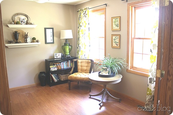
This room is off to the right as you enter our home.  We have the original plans for the house and it was intended to be a dining room (though it was called an office on the real estate listing).  It has French doors that open into it from the hallway which are currently a golden oak color (I would love to change the color!). 

One quick before:

IMG_6361

And now, an after!

 IMG_6873

The walls are a tan/beige color and I’m not really fond of it though the color is better than some other colors in the home.  I plan to paint them Sherwin Williams Worldly Gray  (the color we had in our last dining room—and loved) at some point but there are more deserving areas in our home for paint right now.  The curtains in here are from our last home’s dining room…I made them with fabric I got from Joann Fabrics a couple of years ago.  I like how bold they are and they go great with so many colors. 

IMG_6859

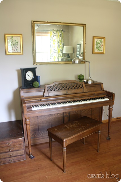
We call it the music room because of the piano that resides here.  It is the perfect spot for it in the house, especially because of the French doors that can be closed for piano practice.  :)

IMG_6887

I am having trouble filling this wall so it looks balanced yet not cluttered.  I got a great idea from another blog to hang a guitar on the wall and I really think that will fill this wall up nicely.  I have one that is just sitting in a closet and this is a music room so it’s definitely appropriate for the space.  I just need to go get the hanging apparatus (hook??) at the store and then we’ll see how it looks. 

IMG_6915writing

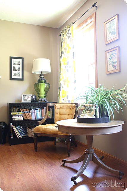
I found this lamp at a Re-Store in my husband’s hometown.  It is actually a huge lamp and I had a really hard time finding a lampshade that would fit it.  The shade that I have is still not quite big enough but it will have to do until I can find a bigger one that is affordable.  I love the green glass base!

IMG_6899

IMG_6888

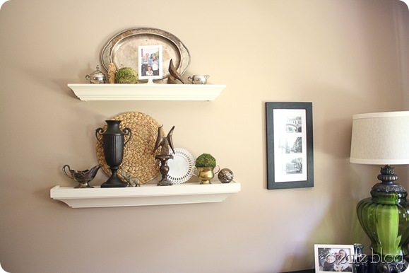
I found the platter on top at a barn sale—I thought the detail with the patina is so interesting.

IMG_6897

IMG_6892edit

And of course I must mention again the tufted chair I thrifted a few weeks ago…it has found a home in this room for now. 

IMG_6885

I’m sure this room will be changing but that is the wonderful thing about most home decor…you can change it whenever the whim strikes! 

Planned improvements:

  • paint walls Worldly Gray
  • finish adding art/photos/guitar?
  • find rug, preferably round
  • change out light fixture (or possibly spray paint…it is a very unappealing rust color right now)
  • add more seating
  • possibly paint trim or stain darker

Thanks for touring the first room in our home!

Tuesday, September 3, 2013

The Tale of the Thrifted Tufted Chair

No comments:

Say that three times fast!

A few weeks ago while I was hitting up our local Goodwill I spotted this chair and literally push-sprinted across the store to take a closer look at it.  Good, the tag was still on it, meaning no one else had claimed it yet!

IMG_6863

It was in amazing shape.  The velvet was still full and soft with no stains, the wicker on the back was in pristine shape,and the wood frame was sturdy with no nicks or gouges.  Best part?  It was $9.99! 

IMG_6832

You’d better believe I ripped that tag off fast.

Then I thought about it as I shopped around the rest of the store.  Did I really need a chair like this?  Would we use it?  Would it become a misfit chair that takes up space in the garage?  In the end, I knew I could easily find a new home for it if we ended up not using it (and I knew if I didn’t buy the chair it would move to the top of my Thrifting/Garage Sale Regret List!) so OF COURSE I bought it.  Don’t worry, I never seriously considered not buying it. :)

IMG_6833 

It has this fun Greek key design on the arms:

IMG_6872

Then I got it home and as I was lifting it out of the car I smelled a bit of funk…oh no!  I hadn’t been totally sold on the color originally so I knew that I might want to re-upholster the chair--but then when I smelled that I realized re-upholstering might have to be prioritized.  I decided to give the chair a good cleaning and see what I thought after.  I know there are lots of people out there who would never buy used upholstered furniture but honestly I have never bought a new piece of furniture nor do we have the money to do so.  I feel comfortable buying used upholstery if I know I can clean it in such a way as to kill all the surface germs and to get out any stains. 

First I vacuumed the chair really really well, making sure to spread out the tufted parts to expose all the fabric. 

I looked at odor-removal tips on the internet but I didn’t have any vinegar on hand (the recent pickle-making had depleted my supply!) so I decided to try Oxy-clean.  I use Oxy-clean instead of bleach most of the time and I’m really a big fan of it so I thought that might kill the odor and really clean up the chair well.  I sprayed it down with a strong mixture of water/oxy-clean until it was soaking wet.  I wanted it to get really deep into the chair in case the odor was coming from the foam.  Also, it was in the heat of the summer here so I knew I could leave it outside in the sun to dry quickly.  I blotted the chair with clean rags and then blotted the chair with fresh clean water to remove some of the Oxy-clean solution.  Then I put it out in the sun for the day. 

If I had spent more money on the chair I would have been more careful to test the Oxy-clean on the velvet first for color-fastness, but in this case I didn’t really care.  I knew I could always re-cover it in another fabric.  It ended up being fine—the color didn’t fade or change at all—it actually looked brighter afterwards. 

The next day I still could smell a little something on the chair so I decided to sprinkle it liberally with baking soda.  I left it out again in the hot sun, and again the next day.  Then I vacuumed the baking soda from the chair and wow, what a difference!  It smelled fine!!!!  I was so happy that it worked.  :)

 IMG_6831

I put the chair in our “music-room” for now.  Who knows, I might still re-cover the chair (I could really picture it in a navy velvet with a white frame) but for now we’re enjoying it as is. 

I’m planning to start a house tour section on the blog soon…it will take a while for most rooms to look photo-worthy (if they ever do!) but the music room is getting close.  :)