We don’t have a lot of free time around here with 3 little ones, so all remodeling projects go super slowly. The upstairs bathroom project goes even more slowly because it is right across from the kids’ bedrooms and therefore any work we do has to be done while they are awake as most remodeling produces a fair amount of noise.
So this is the point we are at. The ugly, yucky, tear-it-all-down, what-are-we-thinking stage. Our two year old walked into the bathroom and said “What happened?” Hmm. What did happen?
This happened.
The blue plastic tile is officially gone. Well, all except for the tile behind the vanity. So perhaps not officially. I’m calling it gone though.
Approximately half of the wallpaper has been scraped off the walls too. The walls are looking surprisingly good. I’m not quite sure why the wallpaper was applied in the first place. I have only found one or two cracks in the plaster so far that will be quite easy to patch. Certainly nothing that necessitated such a drastic measure as floral wallpaper!
Whoops. Overexposed photo alert.
I’m having a hard time finding an affordable and nice medicine cabinet. Preferably something under $50…perhaps Craigslist will come through one of these days. One can always hope!
Hopefully too we’ll start making some more pretty progress soon, though it looks like there will be more demo before we start putting things together.
Have a happy day!
Liz
Wednesday, February 20, 2013
Tuesday, February 12, 2013
In-between Kitchen
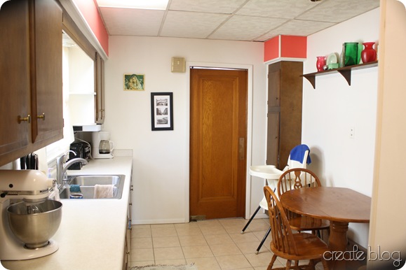
I showed you pictures of the kitchen the way it was when we bought the house here. Those were taken before the first round of renovations were done in early 2010. Clearly, the kitchen needed some serious help. It was like a cave in there!!! I avoided it like the plague and wanted to change it immediately, and thankfully my husband’s fresh chocolate chip cookie cravings agreed with me. We didn’t have the budget or the know-how to do a thorough job of it then, but we knew with a toddler and another little one on the way, that carpet had to go ASAP!! We bought some tile, tore up the carpet and layers of linoleum underneath, and with the experienced help of family we got the kitchen floor tiled in no time. At the same time, I had my sisters come over to help me fill the grooves of the old paneling with drywall mud, sand, and paint the walls so they no longer resembled a dark country barroom. I will have to write about that experience—surely there are others out there who have dark paneling they want to change but don’t have the money or time to completely remove it.
Here is the kitchen after the tiling and wall facelift!
Better than before, no? It is no House Beautiful, but an improvement over the previous dark cavelike atmosphere.
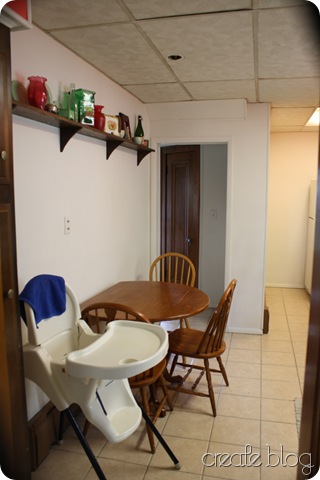
This makes the room look tilty tilty uncle milty.
Much brighter than before. That back area used to be so dark!
I call this the middle stage of our kitchen. Better than it was, but still a ways to go (see that ceiling and the old falling apart cabinets?).
I think the cookie production may have increased slightly after this.
Liz
Monday, February 11, 2013
Friday, February 8, 2013
Pop it Up
Have you ever had this experience: you are making a recipe, you see how many dozens/servings it makes or how many people it feeds, and you think, “yeah, right!! It will never make that much!” and you make it anyway and surprise, it does make as much as it said it would (and more!) which is a huuuuuge amount!
I had that experience today. I don’t believe I have ever had it before. I have had the opposite experience many times, especially regarding cookies. What, they really expect us to use 1 teaspoon of dough for one cookie??? ONE cookie! Can you empathize? We’re not throwing a doll tea party here.
This came about because I was making caramel popcorn today for something this weekend. I popped some popcorn, made the caramel, and then had to pop way more popcorn because that just wasn’t enough and I didn’t want each puff to be completely encased in caramel. Sometimes too much of a good thing is an awful thing. So now I have several gallons of caramel popcorn sitting in my kitchen. Way more than I needed.
Any good ideas for extra caramel popcorn? I was thinking maybe St. Valentine’s Day neighbor gifts, but that might be a little weird.
Have a great day!!
Liz
Thursday, February 7, 2013
Kitchen Hutch Redo
One of the things that we had planned to do in the kitchen once we moved the fridge around was to install a floor-to-ceiling pantry of sorts in the space that it used to occupy. That is, we planned to do it until we found out just how much it would cost to have someone come in and install a custom pantry unit.
Well, lets just say we planned it differently after that. I started looking for armoires and hutches on Craigslist. I soon found that most armoires would be way too deep for that area. I debated between more storage and less decorative appeal, but finally decorative appeal won out (I know, hard to believe!) and I ended up finding a hutch for a good price 10 minutes from our house. When I got it, it looked like this:
Now I need to post pictures of the finished kitchen!!!
(Remember how I procrastinate?)
Blessings,
Liz
Well, lets just say we planned it differently after that. I started looking for armoires and hutches on Craigslist. I soon found that most armoires would be way too deep for that area. I debated between more storage and less decorative appeal, but finally decorative appeal won out (I know, hard to believe!) and I ended up finding a hutch for a good price 10 minutes from our house. When I got it, it looked like this:
(Actual CL photo)
Not gorgeous, but not awful either. It was solid wood which I was quite happy about. It looked, however, a little too rustic and country for me. I knew I would paint it, but the question was what color would I paint it? I went between a jadeite color, white, and grey. Finally I just decided to go with white, since although I had seen some colored hutches that I liked, I really liked the look of the white ones the best. I also thought it would look the best with the various colors of items I might put on the shelves.
I ripped out the little fence-like structures on the middle shelf—they came out really easily and I just filled the little holes with wood putty and sanded them. I also tore off the scroll-y wood piece right under the middle shelf as I just thought it was too much and also I wanted to be able to fit my huge cookbooks in that space.
I sanded, primed, and painted the piece and also painted the hardware white. I had a hard time deciding what color to paint them and finally I just needed to get them on so white they were. Indecision at its best!
Here it is today!
I’m sure others could have “styled” it better, but this is how it has been for a few months and with limited time on my hands, I decided to bite the bullet and just take the picture. I always enjoy finding ‘treasures’ that I can use to decorate the house and a lot of those ended up on these shelves.
Some have meaning to us, such as this blueing bottle my husband’s grandma gave to him recently:
It is dated 1954 and my father-in-law says that he can remember his mom using that bottle when he was little. :)
And some things are just pretty, if you like older pyrex:
So there you have it!
I really like how it turned out!Now I need to post pictures of the finished kitchen!!!
(Remember how I procrastinate?)
Blessings,
Liz
Wednesday, February 6, 2013
Bathroom Inspiration
Yesterday I showed you what our main bathroom looks like now. Today I’m going to show you what I would like our bathroom to look like when we’re done with the renovation.
Our home was built in the 1920s and has a cottage look to it. Someone once described it as “storybook” looking, although that was probably a bit generous. :) I would like this bathroom to be in keeping with the time period of the house and look as though it has always been authentic to the 20s.
Although clearly, after yesterday’s pictures, IT HAS NOT!!
Moving on.
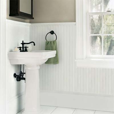
I am planning to go with beadboard in the classic white around the perimeter of the room, going up as high as the blue tile is now.
We will not be getting a pedestal sink (though I’m tempted to because it would add more visual space to the room) because if we do not have a cabinet there will be no storage in the room for the ugly stuff that needs to be hidden away.
I don’t know about you, but we live in the very real world of plungers and bath toys and toilet cleaner and extra bags for the trash can in the bathroom. This isn’t your typical Martha Stewart home.
The medicine cabinet pictured above would be perfect for our bathroom, but as I have been pricing medicine cabinets out, I have come to realize that it is out of our budget for the bathroom. As in, the budget is extremely tight, and my dream medicine cabinet is not worth it, at least for this house which is probably not our forever house. I have been scouring craigslist for something that may work that is more affordable.
Here is the plan for the bathroom:- Beadboard wainscoting around the room
- Re-tile floor and shower/tub surround
- Scrape wallpaper off walls/ceiling and paint a soft greyish-green
- Refinish existing cabinets, perhaps adding some height with legs? and new knobs
- Add new sink in white
- New faucet in brushed nickel
- New side sconces in brushed nickel
- New “floating”glass shelves above the radiator
- New towel bar near sink
- Add shelf above the door for more storage
- New-to-us medicine cabinet (or, if I can’t find one, a mirror)
- Woven-reed blind for window to add some warmth and a natural element
In reality, it will probably take months. Hopefully you aren’t sitting on the edge of your seats, it could be a long wait. :)
Blessings,
Elizabeth
Tuesday, February 5, 2013
60’s Bathroom Gone Wrong
Or, Questionable Design Choices in Blue and Blah
Whilst you are feasting your eyes on our lovely kitchen befores, I thought this might be the perfect opportunity to show you another awful room in the house.
My kids always say when I feed them pancakes: “Give me lots of syrup!”. So I thought that could translate to perhaps nonexistant blog readers saying: “Give me lots of pictures of your scariest rooms!”. There is nothing like pouring bad decor on thick. So of course I will oblige, because unlike syrup which will cause tooth decay, these photos will only cause mild scarring of the eyes which is easy to remedy by visiting other blogs with gorgeous photos. Most likely Life In Grace has something lovely going on today.
Without furthur ado:
Yes, this is our bathroom. In the same house that has the paneled kitchen. We hit the jackpot.
Let us continue by pointing out its various deficiencies:
Oh yes, we also call it our granny or old lady bathroom. The previous owner was a 90 year old woman and while I am positive she had many great qualities…decorating may not have been one of them. Ahem.
Here we have the other side of the room, which you can barely see behind the door. As you can see, I have already started to remove the wallpaper in some areas. It looks worse than it is because of the mess, but it is pretty bad just on its own.
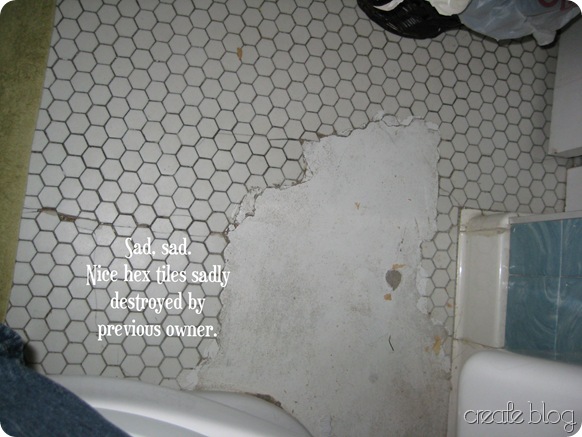
Here we have the original hex tiles that were previously covered with blue carpet (yes, in the bathroom), I suppose to cover the damage to the lovely tiles by a previous plumbing job. Sadly, they have to be removed.
Disclaimer: I did not clean up the bathroom before taking these pictures; I had already started to rip off the wallpaper so I didn’t think it would really matter as there would be pieces of wallpaper everywhere as it was.
Yes, the sink is a shade of baby blue. It matches the plastic tile (see below) which was I believe the look someone was going for.
The floral wallpaper extends not only up the walls but also all over the ceiling and into the shower/bath. More wallpaper removal going on.
It is a laundry chute door, and although the laundry chute has long been unusable (someone hammered it in in a previous kitchen renovation and then we removed the hammered-in metal when we remodeled), I think I can find a use for this neat little bit of character which is original to the house (complete with glass knob).
The mirror/medicine cabinet. Even with a window in this room, it can be rather dark which is why I am using the flash. The room is quite small (just 5’X 5’ excluding the shower) and I am standing in the tub to get this picture. I actually think this medicine cabinet could be neat without the lights on either side, but I think we will take it out anyway and find something that matches the look we are going for. Don’t worry, I plan to keep the mirror for future projects!
I think that is probably enough for one day. :)
And just so you know, this I believe is the single worst room in our house at the moment. So you probably won’t be subjected to the same level of eye-scarring in any future posts.
I will go into our plans for this room next!!
Blessings,
Monday, February 4, 2013
In the beginning…
There was a kitchen.
This kitchen.
Take a good long look. Observe the dark paneling, lovely acoustic ceiling, dirty carpet, and junky cabinets.
And husband walking. Thankfully that hasn’t changed. :)
More:
Not tired of it yet? (Our oldest is so little in this picture!! Awwww…)
Messes always make the after look better. Right???
These pictures are from 2010. It is now 2013 and we have done not one but two renovations of this area. The first was more of a band-aid treatment; the second a total gut job.
Next post: how it looked after the first renovation!!
Baby steps, people. If I haven’t written more than 1 post in the past 6 months, how do you think I’m going to get all the befores and afters into one post??? :)
Blessings,
Liz
This kitchen.
Take a good long look. Observe the dark paneling, lovely acoustic ceiling, dirty carpet, and junky cabinets.
And husband walking. Thankfully that hasn’t changed. :)
More:
Not tired of it yet? (Our oldest is so little in this picture!! Awwww…)
Messes always make the after look better. Right???
(Scary back hallway.)
I still can’t believe it looked like that!These pictures are from 2010. It is now 2013 and we have done not one but two renovations of this area. The first was more of a band-aid treatment; the second a total gut job.
Next post: how it looked after the first renovation!!
Baby steps, people. If I haven’t written more than 1 post in the past 6 months, how do you think I’m going to get all the befores and afters into one post??? :)
Blessings,
Liz
Subscribe to:
Posts (Atom)