Wednesday, January 29, 2014

The Trouble with Blank Walls

8 comments:

So…blank walls are kind of exciting.  They are a fresh start, a space of possibilities, a blank canvas if you will.

But they are also kind of overwhelming.  What to fill them with?  What proportions will look good?  Do I even like this art?  Does leaving it blank highlight or diminish the greasy little fingerprints over the bottom 1/3 of it?  : ) It is especially overwhelming if it is a big blank wall…at least for me. 

I also struggle with indecision between a few different looks I like.  Should I do this gallery wall, or those big prints, or maybe a piece of furniture here?  I have perfectionist tendencies so it’s hard to battle those and just go for something

(You don’t want to be locked in my brain.  It is a battleground of decorating choices, with depression glass missiles and frames tossed about like catapults.  Yikes.)

I was/am facing this in our kitchen/dining area.  It is one big room with one prominent big blank wall.  I filled part of that wall with the coffee and tea station that I go on about ad nauseum.  ; )  But since it was such a large wall there was a part to the left that looked pretty neglected next to it’s showy neighbor. 

See?

IMG_7788

(That darker spot on the wall is just a shadow from a chair…FYI.  And…the coffee/tea area only takes up half the wall, not most of the wall the way it looks here)

Of course, there are other walls in the house that pose problems.  One of them was the wall behind our TV that I posted about (and kind of solved) here.  Since we moved last June I haven’t actually done much decorating on our walls besides these two locations.  There are a lot of blank walls to fill here!  Slowly but surely I’ll get to most of them…though I don’t necessarily think every wall needs to have something on it. 

Back to this particular wall.  In case it is hard to picture the layout of the room, here is a picture of the kitchen area from before we moved:

IMG_6365

The big wall to the right is the wall I’m currently trying to figure out.  I started doing some more on it, then I realized that I didn’t get enough shelf brackets when I was last at Ikea…bummer!!  It will have to wait until I can get there again.  I am hoping I can go tomorrow (and I really would LOVE to go as it is always a fun outing for the kids and I, especially so with the winter we’ve been having) but it is supposed to snow again so we’ll see if the drive is a good idea.  There are a few other things I want to check out at Ikea so I’ve been looking for an excuse to go there again for a while.  : )  If I do go I’ll be showing you that project (including a fun poster I found!) sometime next week (as always around here, fingers crossed!).

So…do blank walls overwhelm you too?  Tell me I’m not the only one!

Monday, January 27, 2014

A Case of the Mondays

5 comments:

Well…wallowing in some severe cabin fever over here…it is once again more than a few degrees below zero and the past few days have been a sleepless blur as our kids got sick yet again this winter.  Does anyone else feel like this winter will never end???  I am hopeful all the kids are almost back to their normal selves but I want--and yet I don’t want--to go out and about because seriously??  It is so cold they closed school again, and we Minnesotans are tough so it has to be downright cold outside!!  I certainly won’t be dragging our recovering toddler out in that. 

To keep myself sane, I brought a bunch of snow inside to our kitchen sink, dragged two kitchen chairs over, dropped some food coloring in and let the older kids at it with spoons, some sprinkles, and play dishes.  I rarely am this fun so they were really excited about it…and I really should do things like this more often.  It kept them occupied for over an hour which is unusual in this house!  Plus, it was amazingly clean—always a bonus for me!!

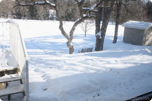
To get some perspective…here is the view out my kitchen window into our backyard…

IMG_7791

And yes, I know it is pretty in many ways!  But, I’m just so ready for it to be green again. 

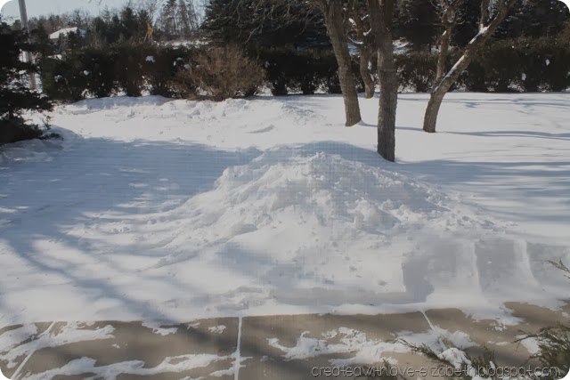
Our driveway is surrounded by mounds of the cold stuff too:

IMG_7797

BRRRRR! 

I hope you’re all feeling a little warmer and pretty please, if you have any grass or temps above sub-zero, can you send them my way???  I will be so grateful!!  : )

Wednesday, January 22, 2014

Our Handmade Sign (from an old board)

10 comments:
When I was thinking up the coffee and tea station I posted about a couple of weeks ago, I envisioned a somewhat retro-looking sign above it that would leave no doubt as to what the area was for.  (If I hadn’t I’m sure I would have gotten a few questions from visitors as to why the dresser was in the kitchen/dining area with the coffee pot on it.  I don’t think my male relatives are in tune with Pinterest! )

Plus, I had always wanted to try my hand at sign-making—and after making one I think I’m hooked!!  SO easy, and such a quick project.  I truly think anyone with a printer could do it.

coffeeteasign

I loosely followed the instructions from Miss Mustard Seed on how to make a vintage looking sign.  I didn’t distress as much as she did as I didn’t want such an aged look, but otherwise I followed these steps pretty closely. 

I started by looking in the shed for a board I could use.  You could definitely use a brand new board, but I knew I had a few old boards stashed in there that I could use.  I ended up choosing this old one from our old kitchen at our previous home. 

IMG_7441

It has a bunch of nail holes and a crack or two but it only adds character, right??  It was approximately 5 inches wide and three feet long.  I started by taking some white craft paint and slightly diluting it with water on a yogurt container top.  I only use professional equipment, obviously. ; ) 

IMG_7444

I used a wide craft brush to paint the whole front, back, and sides of the board.  I let it dry and painted it again to make it less opaque. 

IMG_7445

(You can see that the paint layer is rather sheer here in the picture…with just one layer.)

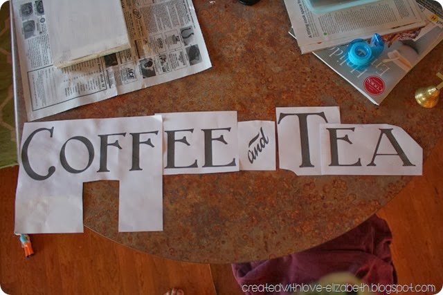
While that was drying between coats I went to the computer and found a font I liked and printed it out for size.  I decided a larger size would look better on the board so I increased it and printed it out again.  I used a different font for the “and” and of course a different size.  I printed everything out on a few different pages and started piecing it together and taping it to fit the board.

IMG_7460

After I figured out the layout I taped it to the board with painter’s tape.  I read on another blog (I can’t remember the name but if anyone knows please let me know so I can credit them!) a great  method on how to transfer the outline of the letters from the printed paper which worked really well for me.  Miss Mustard Seed uses transfer paper but of course I didn’t have any of that and wanted to do the sign right away.  (If you have little kids and have maybe an hour max to craft at naptime you can understand!)

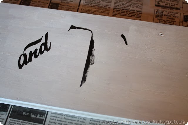
Basically with this other method all you do is take a ballpoint pen and, while pressing hard, trace the outline of the letters.  It works really well!  It creates a little indentation in the wood that you can easily see to fill in with paint.  I bumped up the contrast in this picture so you can see the lines it created. 

indentedit

Then I took a smaller brush and just started filling in the lines with black paint.  It was actually a little like coloring in a coloring book…it was rather relaxing and mindless.  I quite enjoyed it.  : )

IMG_7471

I just kept going until I was done with the lettering…then I decided I wanted a black border so I painted about a half inch border all around it and down the sides of the board.

IMG_7472

It really didn’t take long at all.  I had it done in the bits and pieces of spare time on one day. 

IMG_7474


IMG_7475Just my kind of project!

I sanded it lightly in a couple of places to slightly distress it.  Then I attached two D-rings to the back, making sure to attach them evenly. 

IMG_7737

Time to hang it up!  Yay!!

IMG_7584

And now people know why there is a dresser with a coffeepot on it in our kitchen area.  ; )

IMG_7567


Linking up to DIY by Design’s Winter Blues Wednesday Party,

Monday, January 20, 2014

Love the Home You’re With (1)

No comments:

I think there is always the misconception that other people’s homes are cleaner, more organized, prettier, better designed, etc. than your own.  Of course, sometimes that is true (especially if you have little ones like me!  Nothing  stays clean for long around here!) and I think Pinterest and blogs can feed into that feeling too…I don’t take pictures of my orange-from-iron-water shower I’ve been trying to clean this afternoon!!  It is way more fun to take pictures of something I enjoy looking at in my house!! 

But, usually that grass-is-greener outlook is just plain false!  We all have problem areas in our homes, messy closets, cramped hallways, and so on.  Many times we can do something about it if we have the time, energy, and money…but sometimes we can’t.  And it can really steal our joy if we focus on all the bad stuff we can’t change about our home. 

In our previous home, we had this weirdly pink-ish cream palm wallpaper in the dining room and living room. 

IMG_5332

It covered plaster walls that you could tell were in bad shape…in some places if you looked closely you could tell the wall was cracked and uneven behind it.  So, there was no way I was removing the wallpaper and uncovering a kettle of fish that would be potentially very expensive and messy to fix!

For a long time it was my nemesis.  I felt like I could make other parts of the house pretty but not that area.  In the end I painted over the wallpaper in the dining room and it turned out surprisingly well, but I never did end up doing anything with the wallpaper in the living room. 

But really, it was fine!  We lived happily there and I think now that I spent too much time thinking about that dratted wallpaper and not enough time thinking about ways to draw attention away from it.  Because generally if you can’t fix something, there is usually a way to make it look at least a little bit better! 

So, from time to time, I’m going to be featuring ideas from various blogs that showcase a “work with what you’ve got” mentality.  Cause I’m pretty sure none of my readers live in perfect houses.  (If you do, please let me know in the comments!!!)

First off…I saw this post over at Thrifty Décor Chick a while back, and I thought…what genius!! 

[laundrychute43.jpg]

She (Sarah) had an ugly pipe in her closet and she chose to make it pretty and fun!  Go here to see how she did it! 

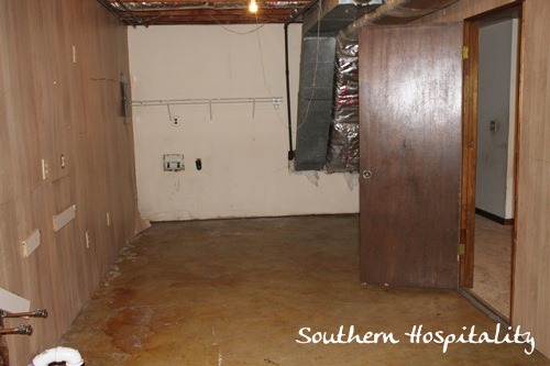
Also, in the same vein…look at the befores in this laundry from Southern Hospitality, in particular those ducts and pipes that go along the ceilings and walls:

Ohter-end-of-Laundry-room-before.jpg

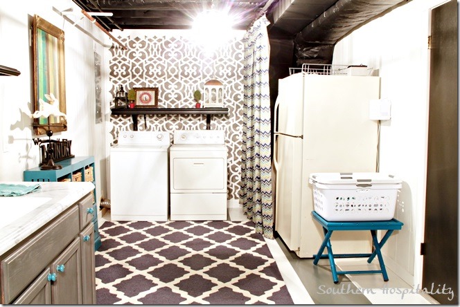
Pretty bad, right??  I would have thought I had to live with that, and cringe every time I did the laundry.  Well, she turned that frown right upside down and made it into a laundry room any of us would enjoy doing the dreaded laundry in.  Just see how those ducts and vents and exposed beams look now!

laundry room side

Now, I know some of it probably cost more than you might have to spend on a laundry space, but the basic changes in this room (like painting the beams and ductwork black and adding that curtain to hide even more uglies) are pretty affordable.  And they make a world of difference!  Find out all Rhoda did to improve this space here. 

And finally, Tanya from Dans Le Townhouse had this pipe-maze and laundry corner that just wasn’t all that pretty. 

(via Dans Le Townhouse)

Since it all had to be readily accessible, she opted to just hide it all in a cheap and easy way.  Go here to see how she did it!! 


I don’t plan to do this every week, but I do plan to make this a regular feature on this blog.  I hope it inspires you (as it does me) to see those flaws in our homes in a new light—something we can change, at least just a little bit!

Monday, January 13, 2014

How I’m liking the new paint color…Collingwood

4 comments:
I’m liking it!!  Shortest post ever!!


Well, not quite.  : )  Of course I am going to elaborate, as we are talking about paint colors here!  One of my favorite subjects (after my kids naturally!). 

Over the course of a few weeks of snail’s pace painting, our kitchen and dining areas are completely painted in Benjamin Moore’s Collingwood.  It is a great gray as it doesn’t have a lot of undertones, at least not in our space.  While I was trying out paint colors (I hashed it out here) I realized that area in our home tends to be a little on the blue-ish side.  I thought I would love a couple of other colors but they fell flat (or blue, as it were) on our walls.  I like that it is light enough to feel fresh yet still allows for white to stand out on it.  After all I wouldn’t want my hutch to feel like a wallflower blending into the wall! (Real life picture here folks…all is not pristine at our house…this is actually cleaner than it often is.)

IMG_7770

I’m going to try to include a few pictures so you can get an idea of what it looks like in case you’re looking for a nice gray!

IMG_7774

Here is a prime example of how colors look so different in different lighting…this next photo is from our front entry area which is currently bathed in warm sunlight…making the paint look more brown-ish!  If you have tons of natural light it will look more like this color.

Also—hello!!!!!!!!

IMG_7781

Yes, we still have our Christmas décor up.  ; )

IMG_7772

Avert eyes from real-life stuff in this photo—gasp!  We eat cheerios like a normal family!!!

IMG_7782

Just to give you some perspective, this whole area used to look like this (from before we moved in):

IMG_6364

In case the color is not as intense on your computer screen as it is on mine, it was a soft lavender/pastel purple color that got old reeeeaaall fast. 

So there you have it.  Collingwood from Benjamin Moore—I like!  Not life changing, but helping with winter cabin fever for sure!

Linking up to Remodelaholic's Anonymous Party

Tuesday, January 7, 2014

Dressier Dresser

21 comments:
Following up the coffee and tea station post a couple of days ago, I’m sharing the biggest part of the project today…the dresser!

Loooong ago when I was a teenager I had this dresser in my room at home.  After I went to college I believe it was used by my younger siblings and then finally found a home in a shed at my parent’s house—then when I moved back to Minnesota I needed a dresser for my apartment so I asked if they needed it anymore and if I could have it.  The answer was yes and it has been in my possession ever since.

However…

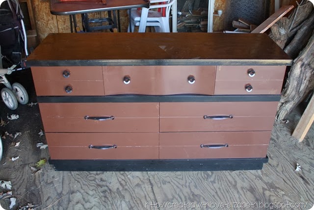
It has always been rather ugly.  It was a blond wood dresser (veneered) with lots of stains and some scrapes, etc.  My parents bought it used so don’t blame me!!  :)  After I got married I thought I could make it more beautiful with spray paint.  You see, I had started to read all these BLOGS and I quickly became obsessed with spray paint and all its merits (of which it has many!!).  It was my first spray paint project!!  (Cue a collective awwwww from similarly obsessed individuals…)  ; )

It did not turn out how I saw it in my head…at all.  See what I mean??

IMG_7434

I was imagining a rich chocolate glossy brown and ended up with a reddish flat-looking unattractive color.  Project FAIL!!!!!  I then painted parts of it black to make it look better.  Trust me, it did make it look slightly better.  ; )

I fairly quickly started looking for a different dresser for our bedroom and used this one for storage in the basement.  Now, at our new house, it was just sitting out in our shed waiting for something…I’m not sure what actually!  I had no plan for it, until I realized that it could be part of a solution for our drawer deprived kitchen/dining area.

I was originally going to paint the frame white with the drawers a fresh seafoam color, but then as I looked at the dresser out in the shed I realized that the drawers themselves were actually in pretty good shape.  I decided to try to strip the paint/blond finish on them and see how the wood looked underneath, and if it was nice to stain it a nice rich brown.  The veneer on the frame itself was peeled off in some places and rather worn in others, so the frame was not something I felt competent at fixing up to a stainable finish.  Plus, the mid-century vibe this piece was sending off would look great as a two tone!

I also had to do a little more prep with this dresser because in some places the veneer was in a sorry state.

IMG_7439

It looks pretty bad doesn’t it!!!  The spider webs from the shed don’t help it any.  I ended up removing all the veneer from this particular part of the dresser and using wood putty to make it look more smooth again. 
I quickly got to work applying the stripper to the drawer fronts and it worked its magic perfectly.  The paint bubbled up and came off with no problem at all.  Yay for spray paint!!  Easy to apply, easy to remove.  :)  I then gave the drawers a quick sand and got them ready to stain.  I used Varathane’s Antique Walnut and it was pretty easy.  They immediately started looking soooo much better!  I used Minwax’s Wipe-On Poly to seal them and give them a bit of shine.

IMG_7513

Meanwhile, I fixed up the dresser frame (sanding it lightly everywhere and fixing the damaged veneer with wood putty (or just removing some parts of it where it wouldn’t be noticeable).  Then I used white spray primer and then white spray paint to create a glossy white finish.  I did all of this way back in November when the days got (barely!) warm enough to use spray paint in the garage.  I also painted the pulls and knobs white as I couldn’t decide on any other color and I didn’t want to wait to buy new knobs from somewhere. 
Here it is all done and being used for our coffee and tea station!

IMG_7566

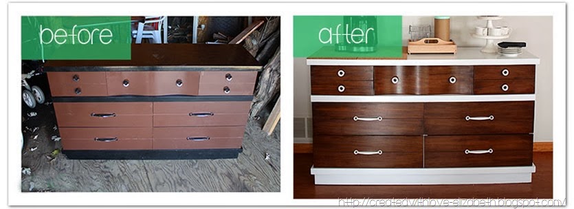
It has come a long way from the project fail it once was!

beforeaftercoffeebar

And best of all, I am enjoying the storage it has for all our coffee and tea supplies plus all the tablecloths, napkins, etc that I had never unpacked from our move this past summer!  And my husband is happy to have a little more space in the shed.  ; )

Sharing over at The Idea Room's "The Party Bunch Linky Party", Remodelaholic's Anonymous Party,  Tatertots and Jello's Link Party Palooza, Be Different Act Normal's Show and Tell,
The DIY Showoff's That DIY Party, Home Coming's The DIYers, and Vintage Revival’s Rock What Ya Got Party

Monday, January 6, 2014

Like Coffee and Tea? Come to my house…

19 comments:
Well, perhaps not literally. 

(Although if you did, I’d be ready for you!)

I don’t think I’ve shared much about my great love of all things tea on the blog before.  I grew up drinking herbal tea when I was sick—and that was pretty much the extent of it.  Until, at least, I encountered the Irish in my travels who cured everything with a ‘cuppa’.  Are you sad?  Come have a cup…  Just in out of the cold?  Have a cup!  Want to talk?  Let me get you a cup…  You get the idea.  I resisted for a while but eventually I grew to love tea (mostly good old black breakfast tea) with a passion.   (My husband actually proposed to me on a tea bag label!) I don’t drink as much as the good old Irish but I usually start my day with a hot cup—with two spoons of sugar and cream, please!

My hubby on the other hand is a coffee drinker.  He doesn’t much care about if it is flavored or fancy, as long as it is strong and hot!  A couple of years ago we got a coffee maker that makes a pot but also makes individual cups of hot water (or coffee) which is perfect for making a cup of tea too.  We really like it, but it was crammed in between the stove and fridge at our  new house and it was a little cramped for all the use we give it.  I decided it was time for a change.

 ( I actually completed this project before Christmas so it was fun to decorate this area for the holidays too.  : )

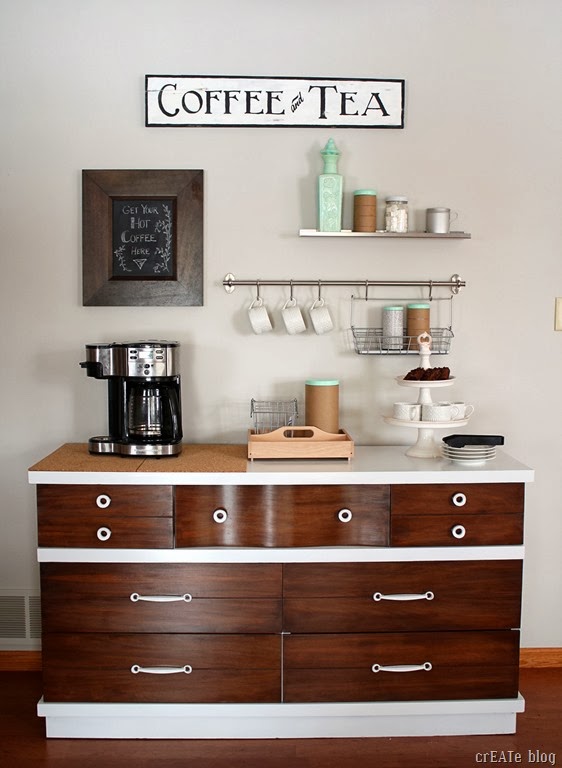
So…our coffee and tea bar!

coffeebar1

I’ve been having fun for the past few weeks getting this little area put together.  First I had to re-do the dresser…then I made a sign…then I painted the wall…it was the project that kept expanding as my ideas grew.  It is finally usable so I thought I’d snap a few pictures before coffee and tea get spilled all over. : )

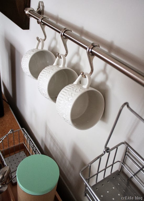
Coffee and tea is kept in the dresser drawers and in the canisters (I still need to move more into the canisters though—and label!).
 
IMG_7568

I’ve been saving up things for this from Goodwill finds and Ikea trips for a few months now.  When it was nearly done I shopped my house and came up with a few more things to make it more useful and pretty. 

IMG_7572edit


IMG_7589

So for now we are enjoying a little more space to make our favorite hot drinks!

IMG_7587

(Can’t forget the sugar cubes!)
IMG_7567

I plan to expand this area a little more to include the space to the left of it, but so far it is just an empty wall there.  (I don’t have all the supplies for that part of the project yet!)

I’ll be back with more about the dresser and a few other aspects of the ‘coffee station’!

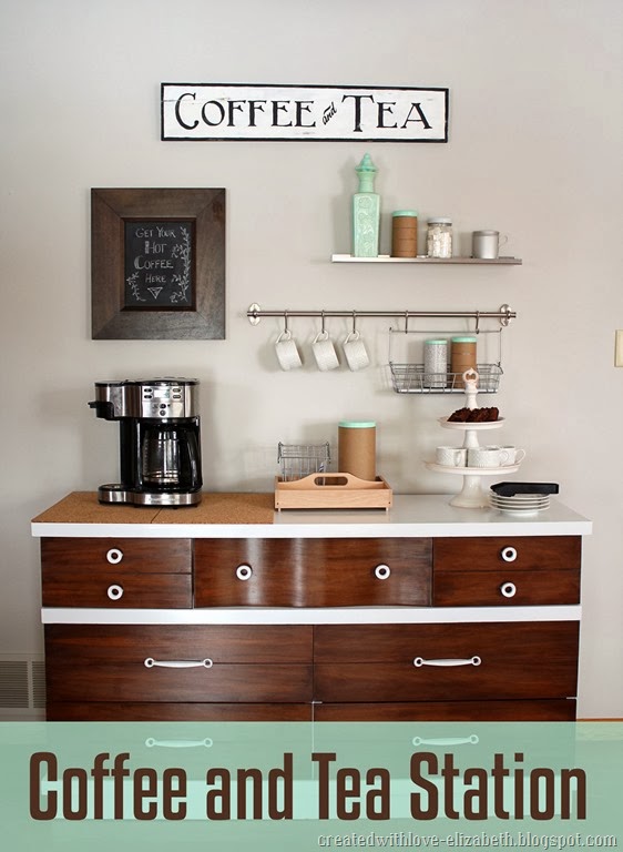
coffeestationbannermint

Linking up with Thrifty Décor Chick's January Before and After Party, Home Coming's The DIYers,
House on the Way's Twirl and Take a Bow Party, DIY by Design's Winter Blues Party, Savvy Southern Style's Wow us Wednesdays, Remodelaholic's Anonymous Party, The Idea Room's "Party Bunch Linky Party, and Tatertot and Jello's Link Party Palooza, Be Different Act Normal's Show and Tell, The DIY Showoff's That DIY Party,

Thursday, January 2, 2014

Coming up for air…

2 comments:

Whew!!  Is anyone else tired out from all the holiday cheer?  I am enjoying it (we don’t take out tree down/stop celebrating right away but leave it up for at least the “Twelve Days of Christmas”—starting on Christmas itself) but boy am I tired!  We had a too-lengthy toddler illness in there too that had both of us up at all hours of the night and caused a bit of worry.  Thankfully that is over and now I’m a little more relaxed.


I have a few little projects to show you in the next few weeks that I got done before Christmas and have lots more ideas spilling out of my head (now that I got a couple nights of good sleep!).  I’m looking forward to the coming year!


I don’t make New Year’s resolutions, but one thing I would like to improve on in 2014 is to comment more on the blogs I read.  I love reading blogs but I rarely comment and I hope to change that.  I know how much I love comments so I can only imagine others feel the same way too! 


Wishing you all many blessings in 2014!